This case study examines the redesign Yelp's Collections page to improve the user experience of the Featured and Suggested Collections workflow and enhance the visual appeal of the page. Upon using the Collections feature, it was noted that the "My Collections" feature disrupts the flow of the Featured and Suggested Collections workflow and the design this page differs significantly from the rest of Yelp's current design. Through redesign, it is hoped that these issues can be addressed and the Collections page can be better integrated with the overall design of the Yelp platform.
This project allowed me to gain valuable experience in adhering to a design guide, redesigning a page to improve the user experience, and creating interactive prototypes.
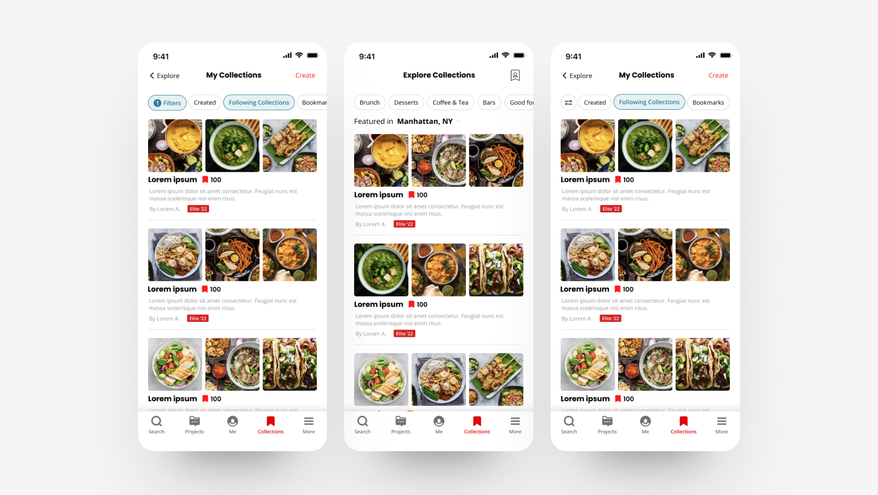
To optimize the user flow of the Collections page, it was necessary to understand the main goals of the page, which include browsing other user's collections, creating and saving one's own collections of restaurants, and following the collections of others. The user collections displayed on the page are sorted into several categories: those featured in the user's current location, collections the user is following, and recommended collections. The recommended collections section shows the top 10 collections.
This image below breaks down what is on the this page.
For the final design, I adhered closely to Yelp's established design standards by using their colors, fonts, and design elements as outlined in their style guide (https://www.yelp.com/styleguide ).
The only new design element I introduced was an icon for "My Collections," which is a combination of the icon used for "Collections" and the "Me" icon on the navigation bar. The "Me" icon was not used in order to avoid confusion with two similar icons in different locations.
This new icon was added to help simplify the wording of "My Collections" and fit it on the same line as the title "Explore Collections" without taking up additional space.
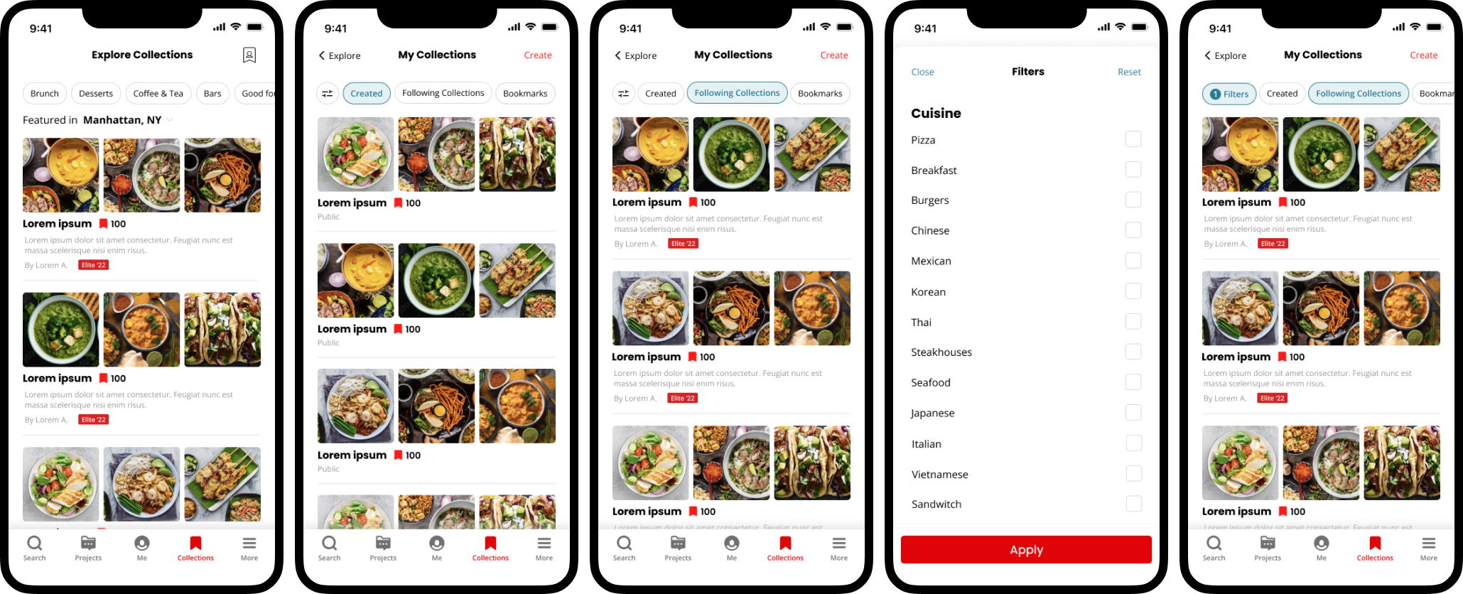
The following is an interactive prototype that demonstrates the workflow for adding a filter to a search within "My Collections." The transitions used in the prototype are meant to closely mimic those currently used in the app.
.gif)
This project allowed me to gain valuable experience in adhering to a design guide, redesigning a page to improve the user experience, and creating interactive prototypes.